Every March, I Hang My Portfolio Like a Museum Show (The Annual Audit, Explained)
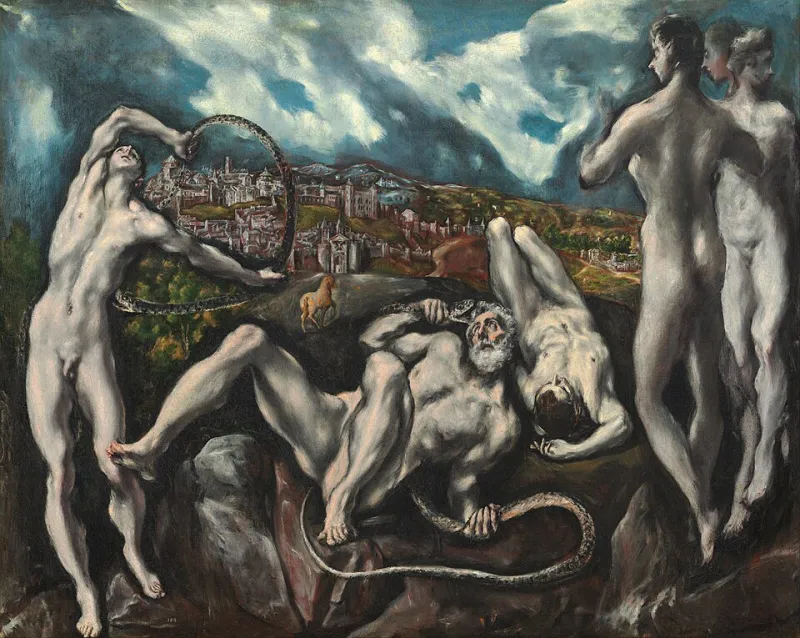
Photo: El Greco, Public domain, via Wikimedia Commons
Every March, something slightly unhinged happens in my apartment: I print out my portfolio. Every project, every caption, every case study—laid across the floor like evidence at a crime scene. Then I walk through it the way I'd walk through a gallery at the Art Institute of Chicago. Slowly. Skeptically. Asking one question in every room: does this piece earn its wall space?
This ritual started three years ago, after a recruiter told me—kindly, over coffee—that my site read like "a really impressive junk drawer." She wasn't wrong. I'd spent four years adding work and zero years removing it. My portfolio wasn't a body of work. It was an attic.
Here's the system that fixed it, in case your own attic needs an annual clean-out.
Think Exhibition, Not Archive
Museums don't show everything. That's the whole trick. A curator at the Smithsonian isn't failing the collection by leaving 95% of it in storage—they're doing their job. The storage room is where things live; the gallery is where things mean something.
Most creative portfolios are built backwards. We treat the site as the archive and then wonder why visitors don't get us. But a visitor isn't a researcher. They're a museum-goer with a coffee and about six minutes. They want a point of view, not a complete record.
So the mental shift is this: your portfolio is a show you're mounting once a year, with a thesis. Mine, this year, is something like "brand systems for people who hate brand systems." Last year it was "small teams, big stakes." The thesis changes. The discipline of having one doesn't.
The March Audit: My Actual Checklist
Block out one Saturday—seriously, one—and run through this list. I keep it in a Google Doc titled "SPRING CLEANING (DO NOT SKIP)" because past-me knew present-me needed the shouting.
1. Read your homepage like a stranger. Not skim—actually read it. Would you hire you based on this page alone? If your headline could belong to five thousand other designers, that's a finding, not a fluke.
2. Count your pieces. Then cut 20%. Yes, really. The project you keep around because a client loved it but that teaches a visitor nothing? The one from 2019 with the dated color grade? Cut. You can always archive, never delete—museums keep everything in the vault. But the gallery shows the strongest work.
3. Kill anything older than three years that isn't a cornerstone. Work has a half-life. A landing page you designed in 2022 is a historical document now. If a piece doesn't represent how you think today, it's teaching people to hire your past self.
4. Rewrite every caption to answer "so what?" Not what the project was—what changed because of it. "Rebranded a fintech startup" is a job description. "Their sign-up conversion doubled in a quarter" is a story.
5. Check for the orphan. There's always one piece that doesn't fit the thesis but you can't bear to cut. Name the reason it's there. If the reason is sentiment, move it to the vault. If the reason is range, frame it as range—give it a caption that explains why it's in the show.
6. Test on a phone, in a hurry. Open your site on your phone while walking to the kitchen. This is how 70% of people will see it, often while pretending to listen in a meeting. If your case studies die on mobile, they're dead everywhere.
7. Update your "about" photo if it's older than your oldest portfolio piece. I have no notes. I just violate this rule annually and regret it.
What Cutting Actually Feels Like
I won't pretend it's painless. The first year I did this, I removed a project I'd spent six weeks on—a packaging redesign that went nowhere because the client folded. I'd kept it online out of sheer sunk-cost stubbornness. Cutting it felt like admitting the six weeks didn't happen.
But here's what a curator knows: the strength of a show is measured by its weakest wall. One mediocre piece doesn't just sit there—it quietly lowers the perceived quality of everything next to it. That packaging project was dragging three strong pieces down with it. The week after I cut it, two people reached out referencing the case study next to where it used to live. Coincidence? Maybe. But I've noticed this pattern enough times now to stop calling it coincidence.
The One Question That Decides Everything
If you only take one thing from this checklist, take this: for every piece on your site, ask "what does a visitor learn about me from this that they couldn't learn from the piece before it?"
If the answer is nothing, you've hung the same painting twice. Visitors won't articulate it, but they'll feel it—that vague sense that the portfolio is repetitive, that the person behind it has one trick. Ten pieces that each teach something different beat thirty pieces that teach the same lesson louder.
Make It a Date
The reason most portfolios rot isn't laziness—it's that updating feels like a response to opportunity, so we only do it when opportunity knocks, which is exactly when we have the least time and the most panic. The audit flips that. March is my month because it's slow for me, but pick whatever quarter is quiet for you. Put it in the calendar. Print the pages. Walk the gallery.
Your future self—the one scrambling to send a link at 11pm before a big interview—will be so grateful she could hug you. Mine has been. Twice.