My Mood Boards Were Making Me Boring: Confessions of a Recovering Pinterest Addict
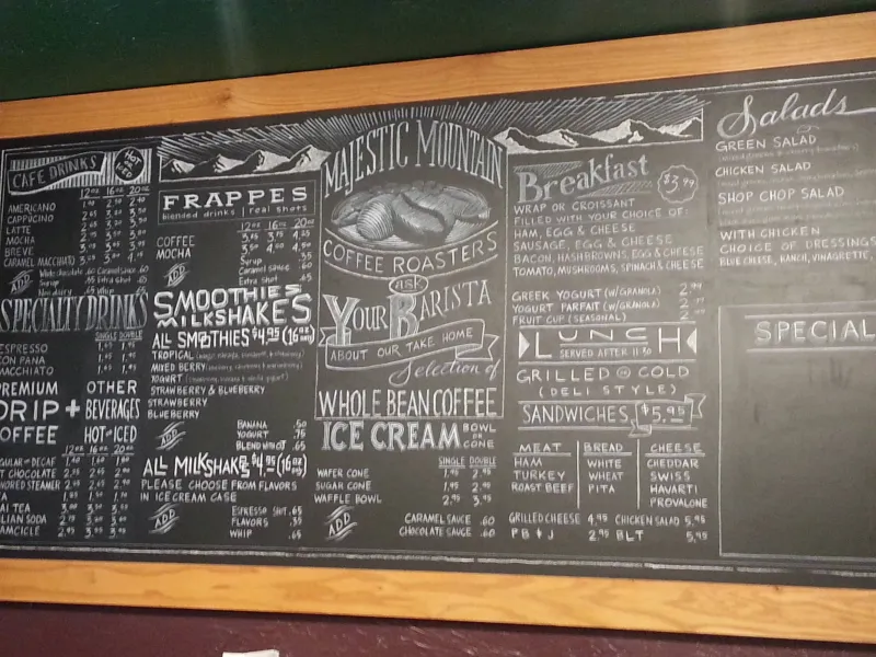
Photo: handwritten diner menu board chalk signage americana, via i.pinimg.com
Let me confess something embarrassing. Last spring, I opened my portfolio for a self-audit and got that cold, sinking feeling you get when you run into someone wearing your exact outfit. Project after project—different clients, different briefs—somehow all radiated the same energy. Muted terracotta. A serif with personality. Generous whitespace. Tasteful.
Tasteful is a trap, by the way. More on that later.
The Algorithm Was Designing For Me
Here's what I'd been doing: every new project, I'd open Pinterest, type in something like "boutique branding mood board," and save the twenty best-looking results into a Figma file. Twenty minutes later, I'd have a beautiful reference sheet and, without realizing it, a ceiling.
Because here's the thing nobody tells you about algorithmic inspiration: it's a mirror. Pinterest shows you what's already popular. The people who pinned those images were inspired by other pins. I was three or four remixes deep from the source, producing work that felt familiar in the worst way. Clients kept saying things like "love it, but can it pop more?"—which, I now understand, was their polite way of saying it looked like everything else.
The mood board wasn't helping me think. It was helping me conform.
Enter the Field Notes Habit
The shift started small. I was waiting for a coffee at a diner in Jersey City—stuck, mid-project, scrolling my phone—when I noticed the menu board. Hand-painted, corrected with paint markers, a "BREAKFAST SPECIAL" where the B had been repainted twice. It was confident in a way no Pinterest save would ever be, because it had been made by a human solving a real problem in a real place.
I sketched it. Badly. Wrote a note underneath: "corrections left visible = charm, not failure."
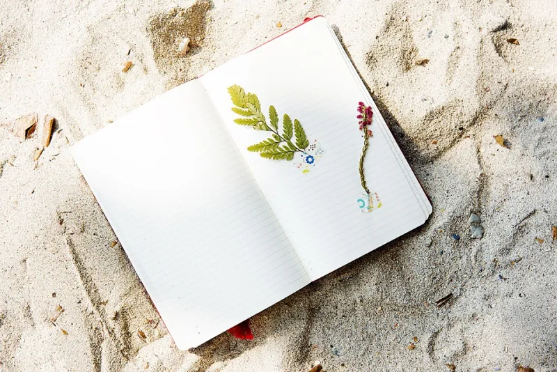
That was four months ago, and now the habit is non-negotiable: I carry a pocket notebook everywhere, and I document real life like a weird anthropologist. Diner signage in the Poconos. The typography on a bodega awning in Hell's Kitchen. Overheard conversations at a rest stop off I-80 ("It's giving hardware store," said a woman about her nephew's band, and I wrote it down because the cadence was perfect). The faded paint on a laundromat window where you can see three generations of business names layered over each other.
What Changed in the Work
Before: a restaurant rebrand that looked like every farm-to-table deck on the internet—reclaimed wood texture, a serif, an olive branch somewhere. The client was nice about it. The work died in round two.
After: a bakery rebrand built entirely from my field notes about handwritten price tags and the taped-up "ASK ABOUT OUR LOAF OF THE DAY" sign. The type was a little crooked on purpose. The color palette came from a photo of sun-bleached awnings in Queens. The client cried a little. We sold out of loaf of the day, which I choose to attribute to the typography.
The difference wasn't talent. It was inputs. When your references come from a feed, your work looks like the feed. When your references come from a diner in Passaic, your work looks like nowhere else.
Try This Week: Three Exercises
The Signage Crawl. Pick a commercial strip in your town—any main street works—and walk it end to end. Sketch or photograph every sign that makes a decision you wouldn't have made. Write one sentence about why it works. Do not open Pinterest for 48 hours afterward.
The Eavesdropping Log. Record (in a notebook, keep it legal and kind) five fragments of real speech this week. Actual human rhythm—interruptions, run-ons, weird metaphors. Then write your next headline, tagline, or case study intro using that rhythm instead of copywriting voice. Real speech beats brand voice every time.
The Wrong Camera Roll. Go through your phone photos and find the five worst pictures—blurry, accidental, ugly. Pick one and steal something from it: a color combination, a composition, a crop. Constraints from real life produce more original work than curation from a feed.
Tasteful Is a Trap
Here's my closing argument. "Tasteful" is just another word for "inoffensive," and inoffensive is invisible. The mood board taught me to be tasteful. The diner menu taught me to be specific. Specific is what gets remembered, quoted, and hired.
The Pinterest tab is still open on my laptop. I'm not gonna pretend I'm cured. But it's a spice now, not a meal—and the notebook comes everywhere.