Kerning My Calendar: What Typography Taught Me About Saying No
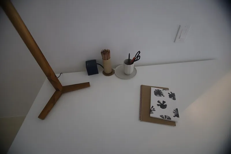
Photo: Category:Government of the United States Virgin Islands, Public domain, via Wikimedia Commons
Design school taught me a lot of things. It did not teach me how to tell a client that no, I will not 'make the logo bigger and also redesign the entire brand by Friday.'
That skill I learned the hard way, and weirdly, I learned it from typography.
The Cramped Line of Text That Changed My Mind
A few years ago, I was staring at a paragraph in a layout that just wouldn't breathe. Every line was packed edge to edge, no leading, no margin, letters practically elbowing each other for space. Classic rookie mistake, and I knew the fix: add white space. Give the content room to exist.
Then I looked at my calendar and laughed out loud, alone, in a coffee shop in Portland. My week looked exactly like that paragraph. Back-to-back calls, three overlapping deadlines, a 'quick favor' for a friend of a friend squeezed into Saturday morning. I had designed a beautiful, breathing layout for a client while cramming my own life into 9-point type with zero leading.
If I wouldn't ship a page that dense, why was I living one?
White Space Isn't Empty (and Neither Is a Free Tuesday)
Here's the thing nobody tells you about white space: clients always want to fill it. You leave a generous margin, and suddenly there's a request to add one more banner, one more CTA, one more paragraph 'since there's room.'
Your calendar works the same way. The moment people sense a gap in your schedule, it becomes community property. 'You're free Thursday afternoon, right?' I wasn't. I was resting, which is a professional activity, thank you very much.
So I started treating my open slots like a designer treats a margin: intentional, load-bearing, and not up for negotiation. When someone asks to squeeze in, I say what any good art director would say: 'That would compromise the composition.' Okay, I don't say that out loud. But I think it very loudly while I type 'I'm at capacity that week.'
Hierarchy: Not Everything Gets to Be a Headline
Every design decision is a ranking. What's the primary message? What supports it? What's decorative and can be cut without anyone noticing?
My commitments needed the same treatment. I sat down one Sunday and listed everything on my plate, then assigned it a hierarchy:
- H1: Paid client work I actually enjoy
- H2: Projects that build skills or relationships
- Caption text: The rest of it, including the LinkedIn challenge someone tagged me in and the 'podcast guest spot' that was really a 45-minute sales pitch
The brutal part of hierarchy is that promoting something means demoting something else. You can't make everything bold—typographers have known this forever, which is why a page where everything screams reads like silence.
Contrast: Making the No Actually Visible
A boundary buried in hedging is like a headline set in 10px gray type. Technically present, functionally invisible.
For years my nos sounded like: 'I might not be able to, but maybe, unless something changes, possibly?' That's a yes wearing a costume. Clients heard 'maybe' and kept pushing, because maybe is an invitation.
The fix was contrast. Short sentences. Clear language. 'I can't take this on.' Full stop. No apology paragraph, no three explanations, no offering a discount on a different service to soften the blow. It felt rude for approximately two weeks. Then I noticed clients respected it more. Turns out people trust a designer with a clear point of view, even when the point of view is 'no.'
Editing: The Skill They Skipped in the Syllabus
We had critiques for our layouts. Nobody critiqued our commitments. So here's the critique I wish someone had given me at 24:
Your career is a composition, and every yes is an element on the page. Add enough of them without editing, and even the good stuff turns to visual noise. The strongest designers I know aren't the ones who do the most—they're the ones whose work has room to breathe. Their portfolios are curated. Their schedules should be too.
These days, before I take anything on, I run it through the same test I'd run on a layout: Does it improve the composition? Does it have hierarchy? Is there contrast between this and everything else? Or am I just afraid of the empty space?
Because here's the kicker I keep relearning: the empty space is the design. The margins are where the eye rests. The unscheduled Tuesday is where the good idea shows up.
Set your life in a bigger point size. Add leading. Cut the caption text. Nobody ever thanked a designer for a cramped page, and no one's going to thank you for a cramped calendar either.